
News
For more than 23 years, the Pantone Color of the Year has influenced product development and purchasing decisions in various sectors including fashion, interior design, industrial design, product packaging and graphic design.
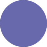
In 2022, Pantone gives us a new color with intense shades of the Periwinkle color with purple and red undertones. The fascinating PANTONE 17-3938 Very Peri places us in front of a new light and helps us to embrace the creative spirit that animates in each of us, opening us to countless possibilities.
Who has chosen this color, explains the concept behind this choice:
If we are renovating the house and we want to use the Pantone 2022 Very Peri we must choose the right combinations, to make everything harmonious and elegant. Lovers of bright and pastel colors may have no problem matching the decorations inside the periwinkle room. Neutral and minimalist decorators, on the other hand, may react dubiously.
So, how to use this color?
Purple and blue convey calm and relaxation, so they are well suited for use in environments such as bedrooms. The idea is to color (with wallpaper or plaster) the wall behind the bed, declined in a soft and harmonious way.
The periwinkle color can transform a bathroom into a wellness sanctuary for relaxation (just like a spa). Based on the 2022 design trends, this is precisely the goal of many who want to renovate their homes in the near future.
It also happens that you want to give a touch of color to your kitchens and the island format perfectly matches this style. Abroad, the most chosen color is periwinkle because it gives the space an intense dose of color.
To avoid mistakes, it is important to compose a color palette that you can trust in the choice of furnishings, floors and coverings. Once you have identified the palette, you can indulge yourself with the combinations.
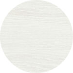
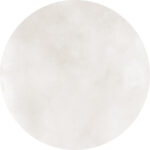
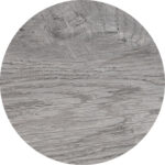
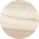
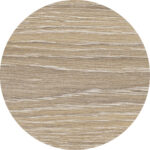
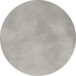
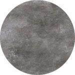
You can make the Pantone 2022 color the protagonist by accompanying it with neutral and classic shades: think for example of the elegant Tronçais wood-effect slats in the Dune shade or a more neutral color with a soft surface by Me_tra Frost.
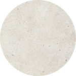
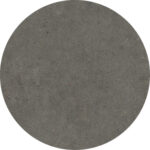
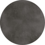
It is also possible to combine other more intense and dark shades with Pantone 2022 such as the Dark color from the Ar_gent series or Graphite from the Block collection
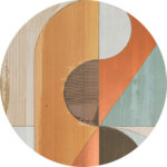
For the more daring, Very Peri goes very well with some decorations from the Art by Sichenia line. They are intense colors but if combined with the right doses and with the correct furnishings, they can create unique and original environments.

Do you want to build the house of your dreams? Discover the other Sichenia collections perfect to integrate any environment.